Decreasing Drop Rate from 95% to 85%
Context
Lemonade Fashion is a fashion e-commerce website that also has a launched app, and although Lemonade Fashion does a great job at getting new users into the app and website, they find that the purchase rate is low and they wanted to know why, and after checking through google analytics it showed that the checkout had a whopping 95% drop rate, so we needed to figure out why.
My Role
UX Researcher
UI Designer
Hand-offs to Developers
Product Review
Methods
Competitor Analysis
UX Audit
User Interviews
Information Architecture
Tools
Figma
Slack
Jira
Time Period
3 weeks
Status
Released
Main Goal
Check the reason for the huge drop rate and redesign accordingly on all used platforms.
Problems
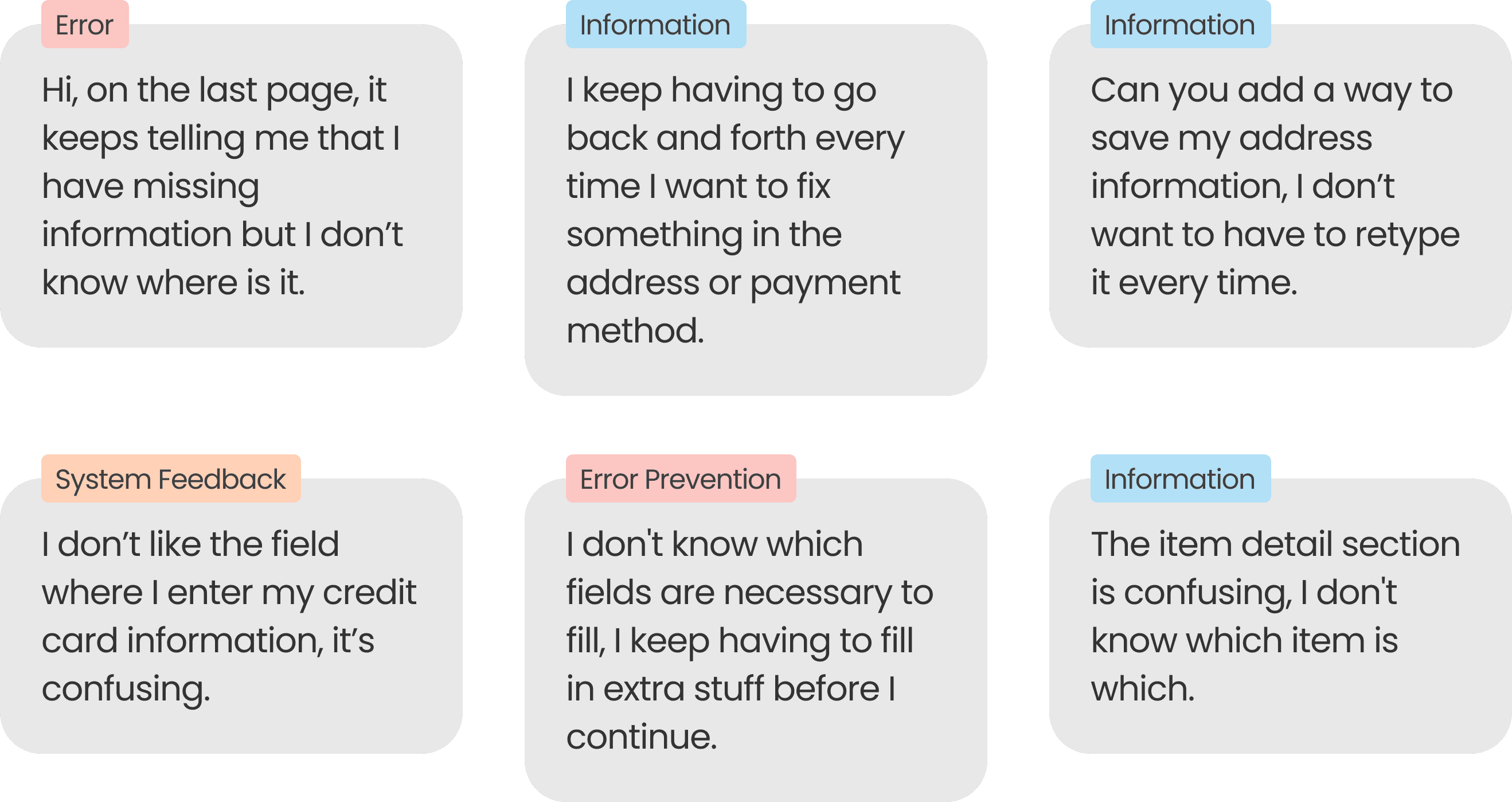
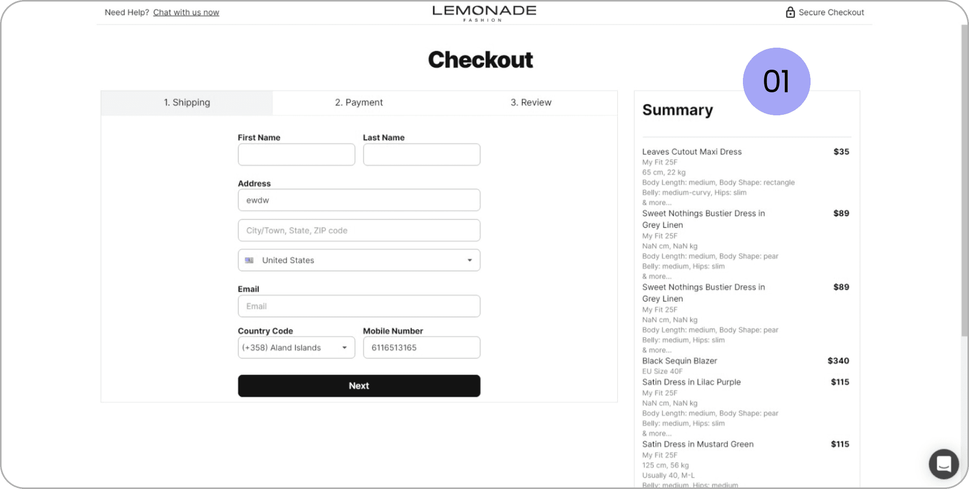
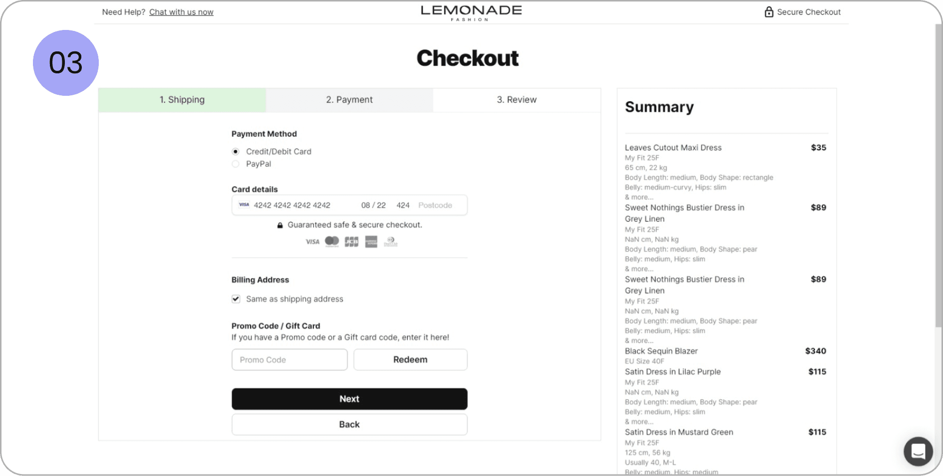
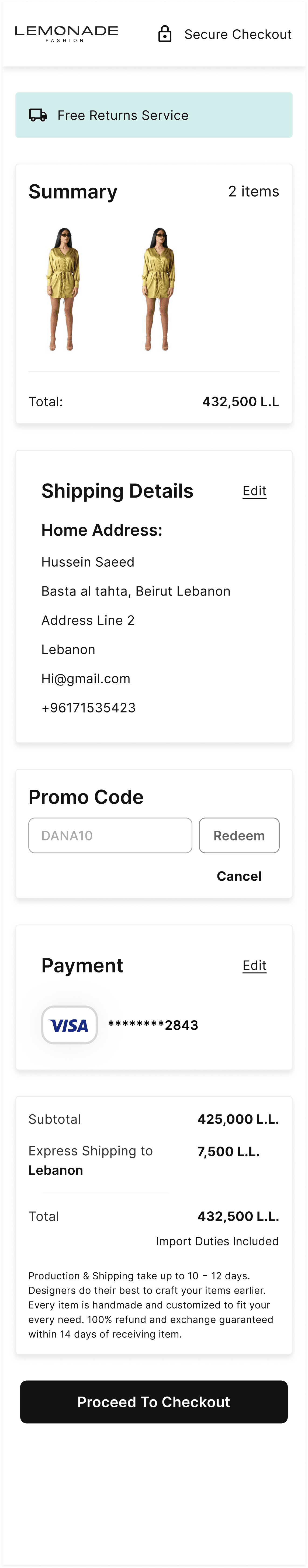
Not understanding the summary section
No images of items for users to know which text is related to which item.
Having to re-enter information every time
The website and mobile didn’t support saving addresses and payment methods.
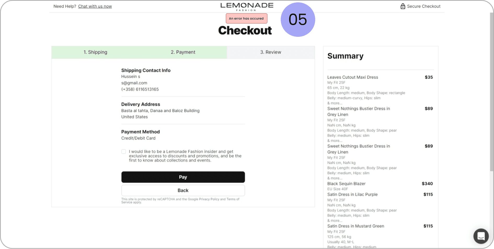
Errors occurring and not knowing why
Errors for wrong payment methods showed up in the review section instead of their corresponding sections and without direct information of why.
Editing Information is difficult
Users had to move between different pages whenever they needed to add a piece of information.
Business Goals
Decrease drop rate by at least 5%
The analysis done needed to see why the drop rate was so high as well as how to decrease it.
Allow for faster Checkout Process
The redesign needed to allow the user to go through the process at a faster rate.
Allow for better information scanning
The redesign should allow the user to scan all the information easily to feel safe that he is taking the right decision
Success Metrics
Reduce drop rate
This will be analysed by seeing the amount of sales going through and through tracking on google analytics and mixpanel.
Finishing the checkout process in under a minute
Having a faster checkout will reduce the possibility of the user changing his mind.
Reducing messages from customers about their orders data
This will show higher satisfaction from the user and show that the solution is working well for them.
Research
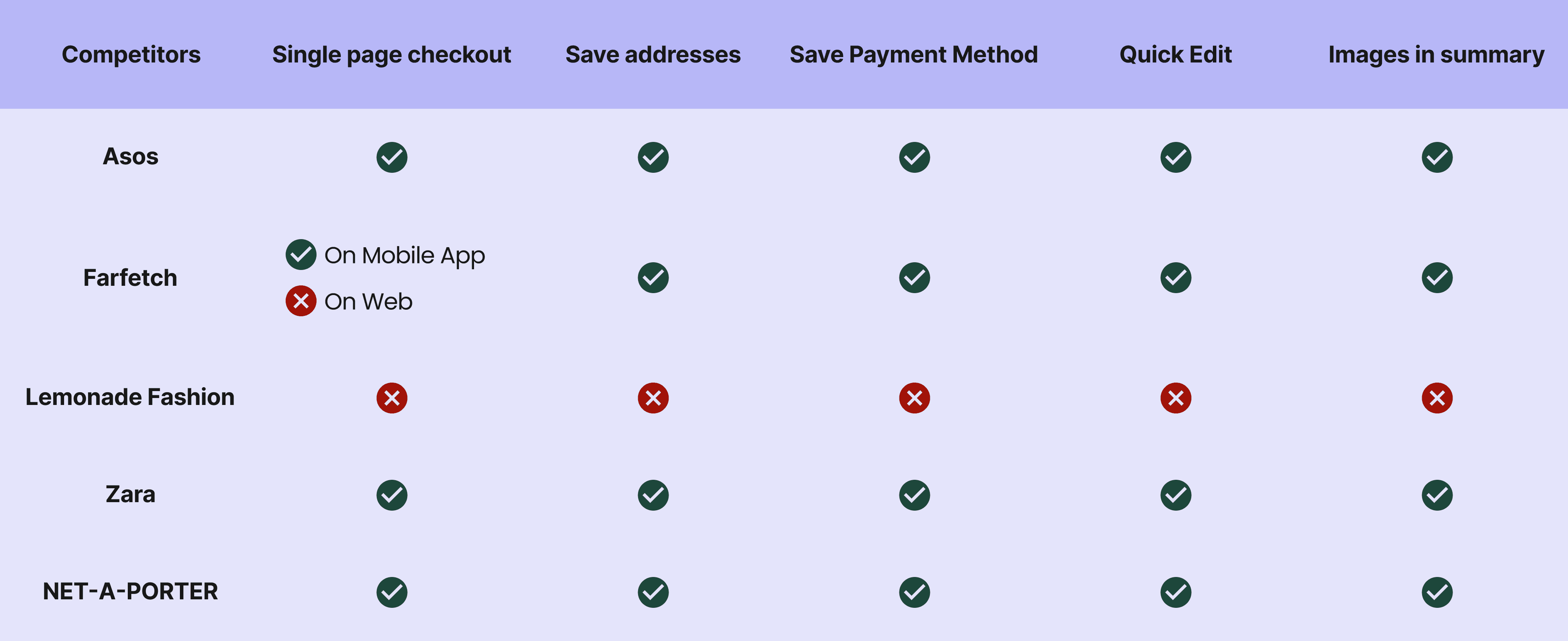
Competitor Analysis
Analyzing the features that competitor websites have and seeing what we are lacking and if it is valuable to us.
User Feedback
These were all taken according to messages and calls received from users during the checkout process:
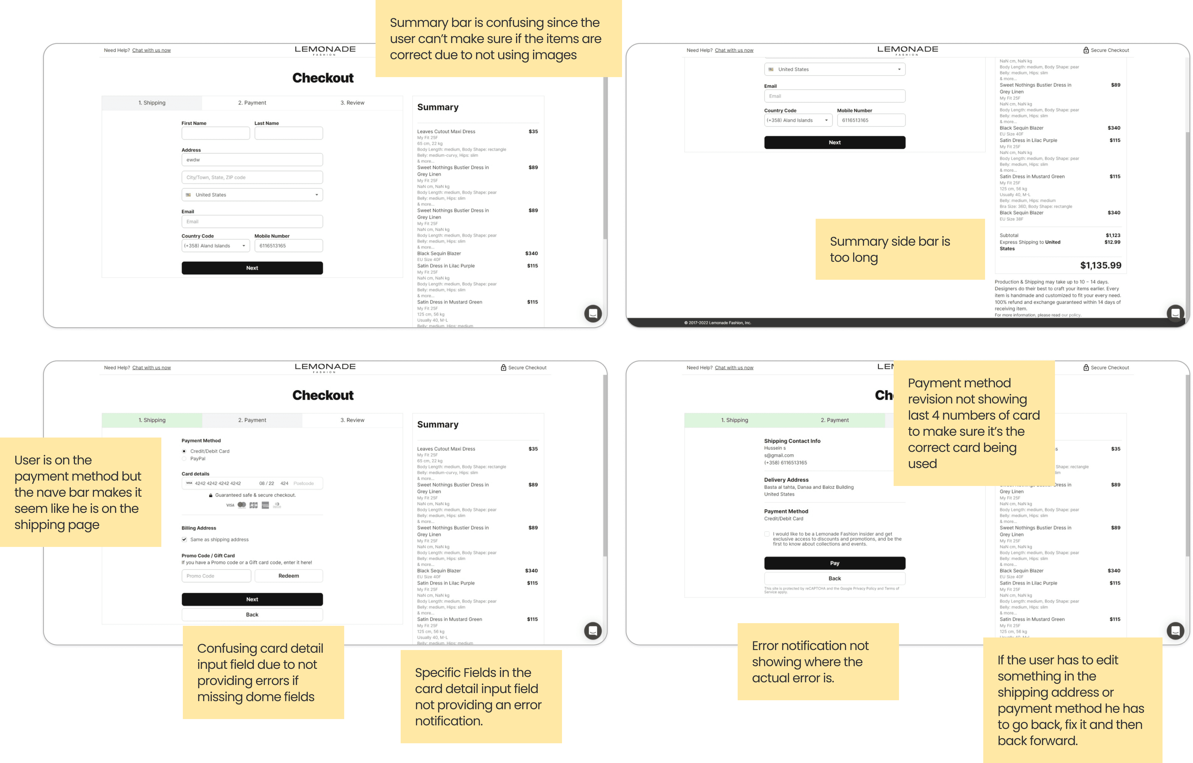
UX Audit
These were all taken according to messages and calls received from users during the checkout process:
Decision
After doing the UX Audit it was agreed upon with the project manager to go with a complete redesign for the Checkout Page.
Areas of Improvement
01. User is confused
Analyzing the features that competitor websites have and seeing what we are lacking and if it is valuable to us.
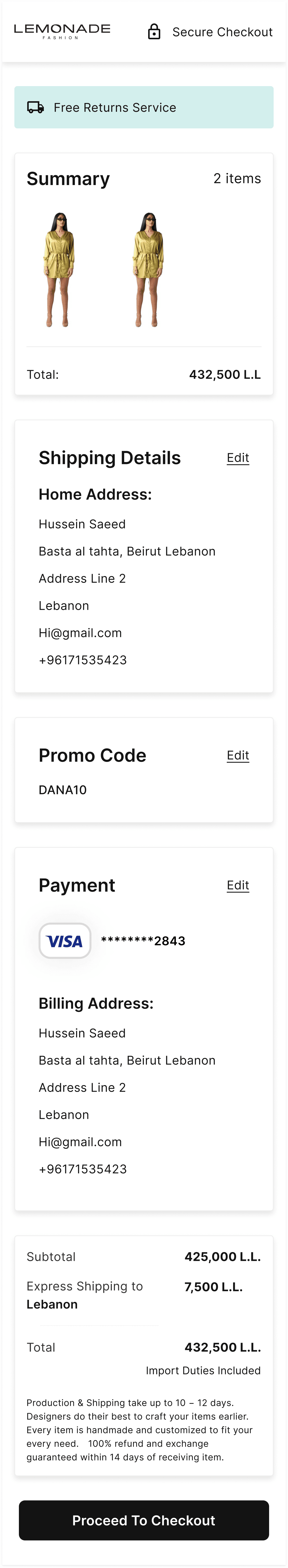
02. Editing takes time
Whenever the user wants to edit some information after reaching the review page, they have to go back to that page and back to the review page after finishing which wastes a lot of time.
03. Confusing color choice for nav bar
The current nav bar made users think they were still on the shipping page at first glance rather than payment due to the color choice.
04. Error Messages not showing on payment method
Error Messages were only showing if the user had a missing field in the card number but didn’t inform them when something was missing for expiry date or postal code.
05. Late Error Messages
User would get error messages for missing information in the card details at the review page rather than the payment page
Missing Features
Saving of Shipping Addresses and Payment methods
Showing pictures of items in the summary page next to their details
Edit button at the review page to allow for quick editing
Requirements
Derived from the research and users feedback
Design for mobile first since most users are on mobile
Allow for better feedback
Change from a multiple page checkout to a single page one, which makes it faster
Must support saving of shipping addresses and payment methods
Summary must support images
Allow users to edit easily
Constraints
The Redesign must use the same input fields as the old one.
Showing pictures of items in the summary page next to their details.
Edit button at the review page to allow for quick editing.
Concept
Sketches
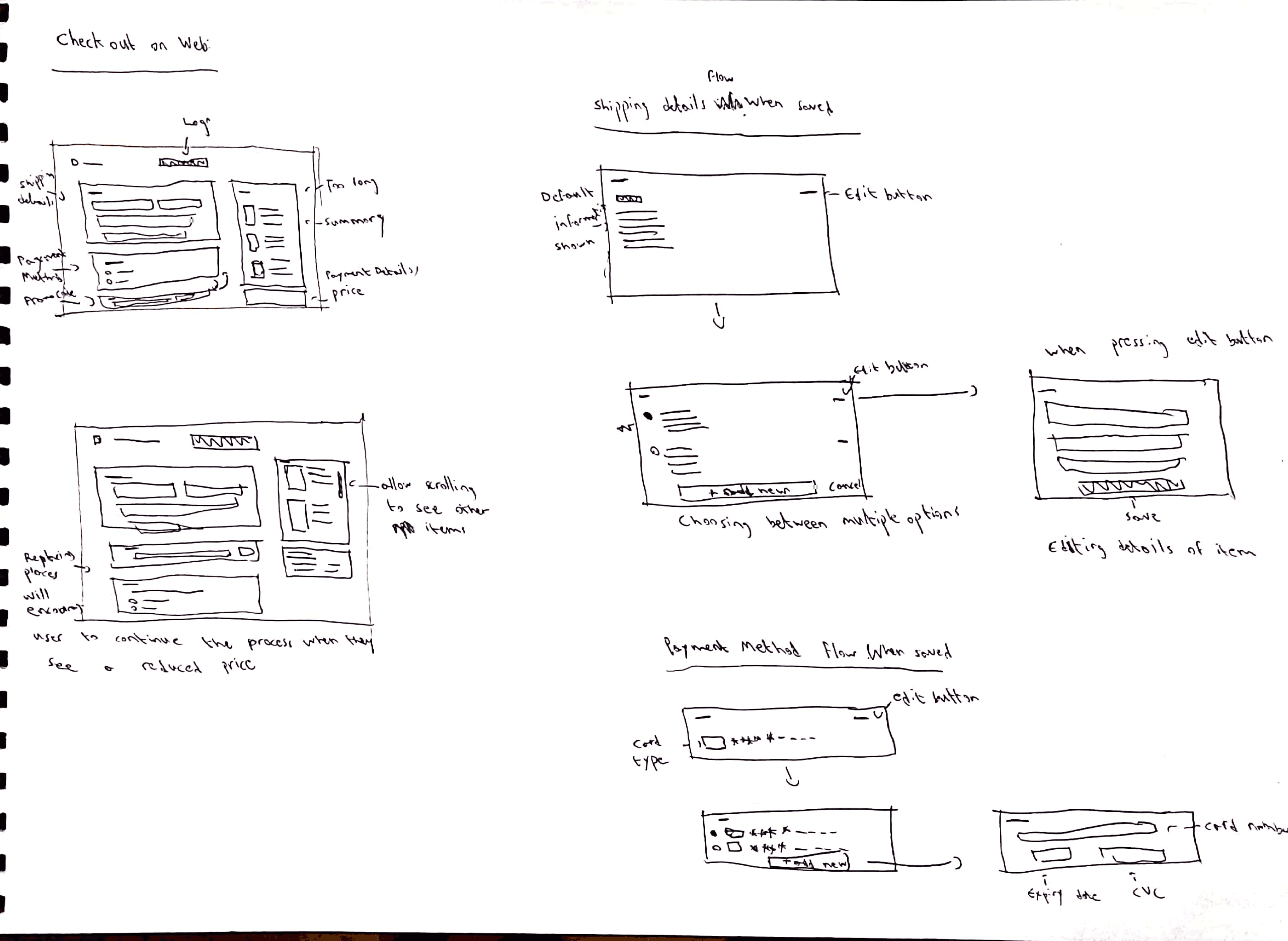
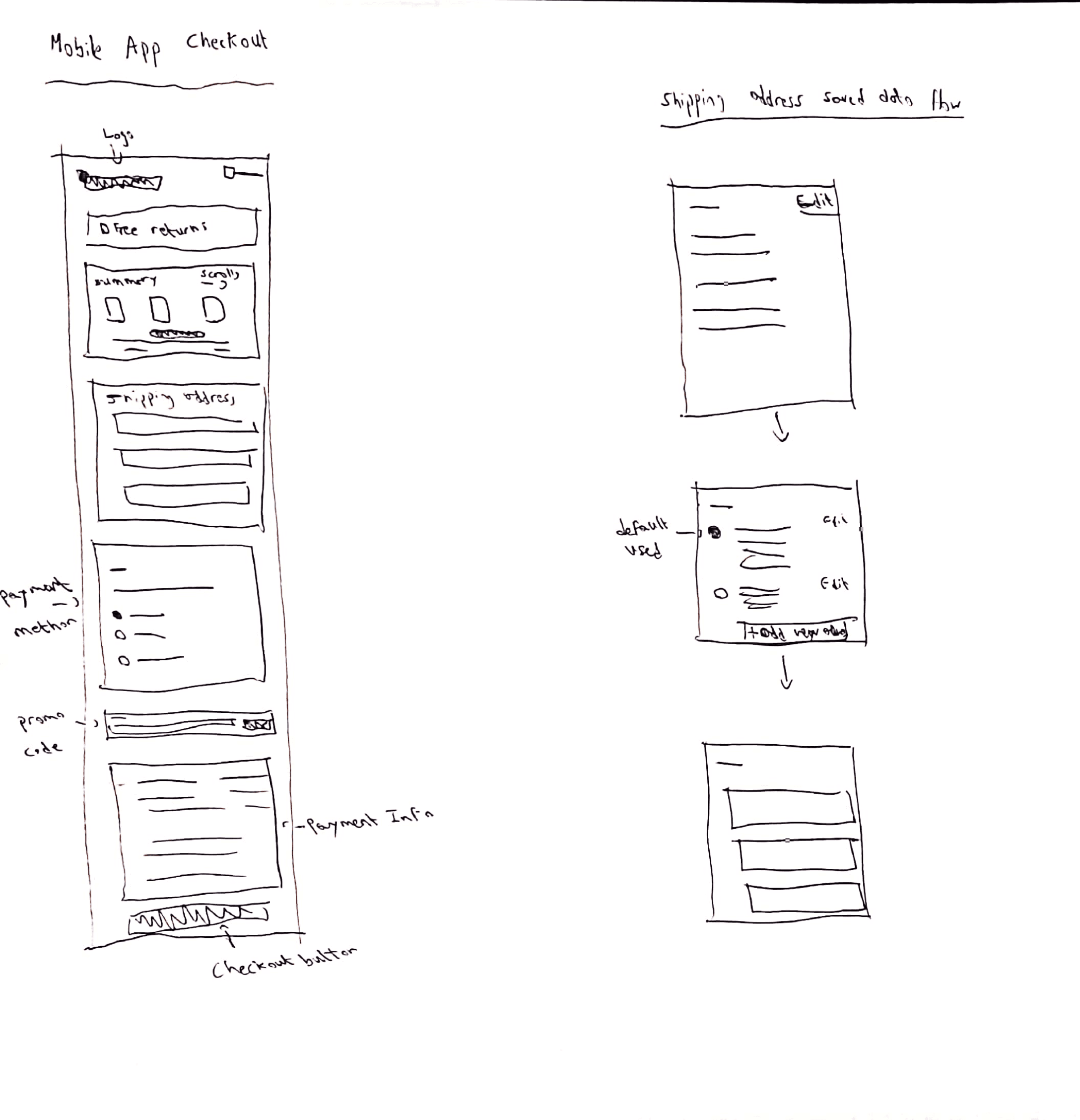
Information Architecture
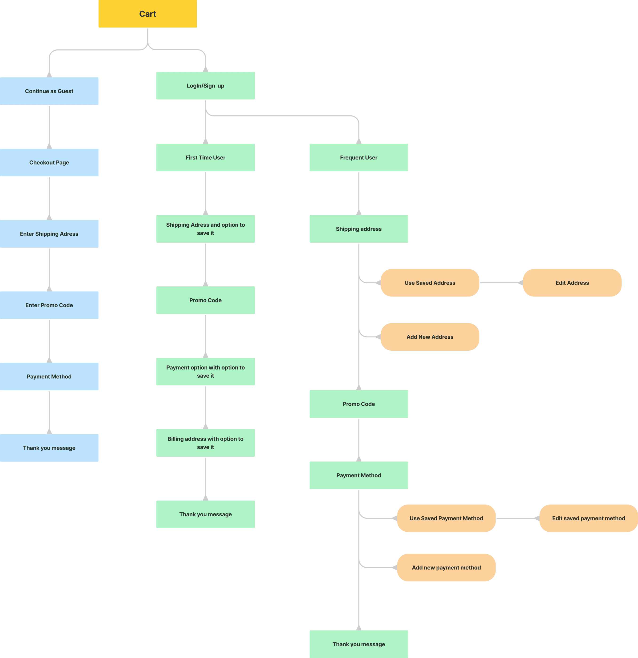
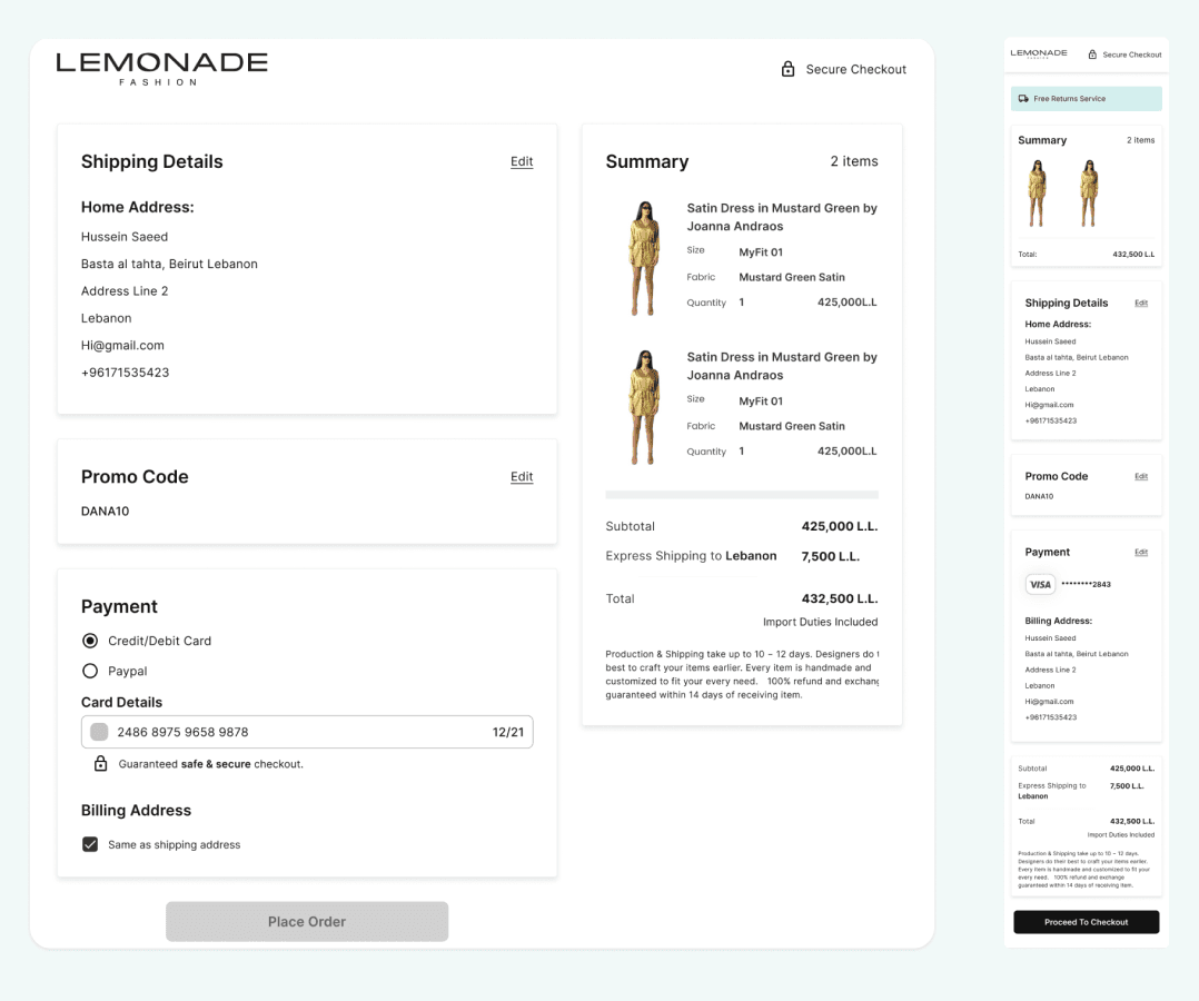
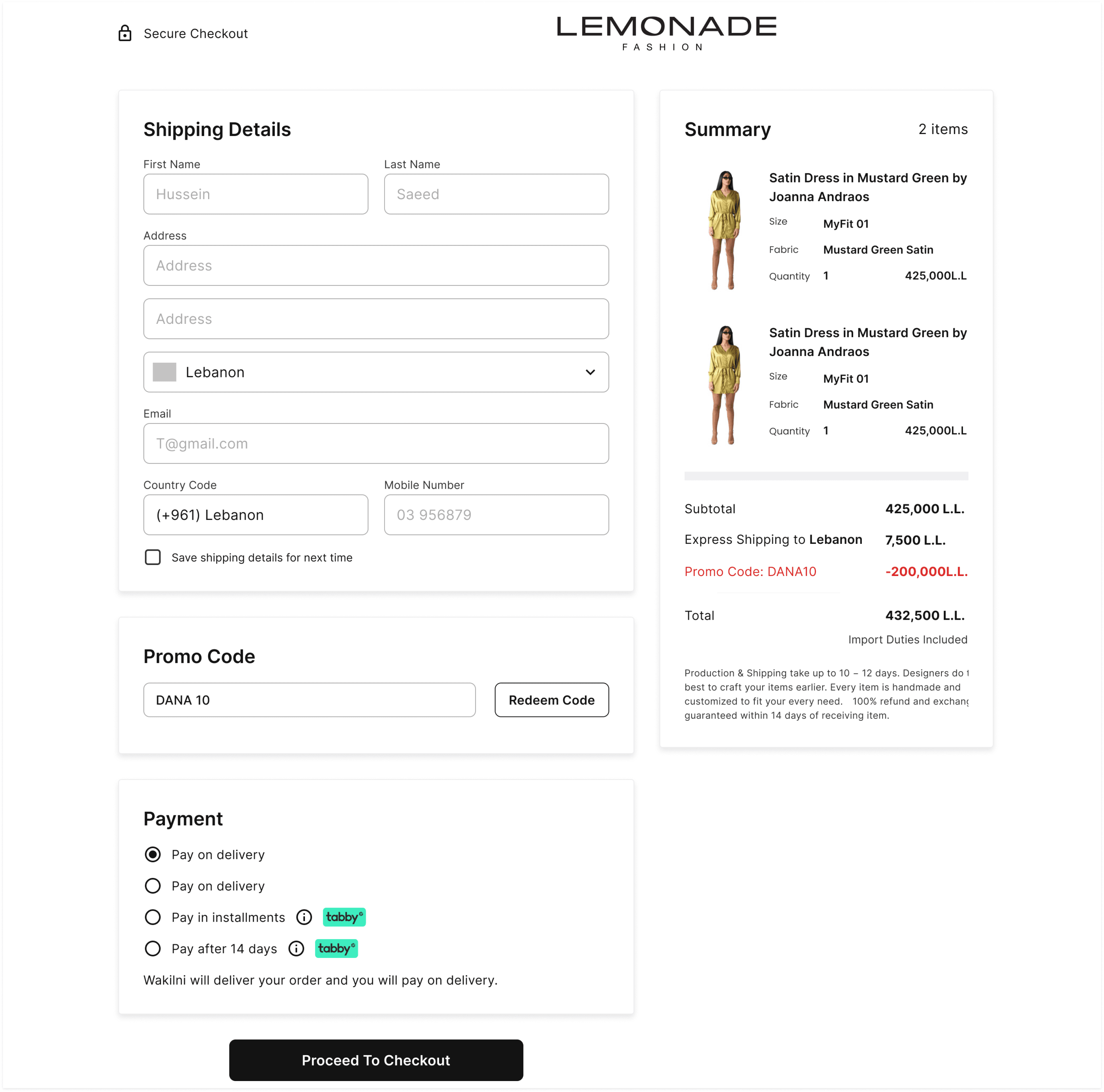
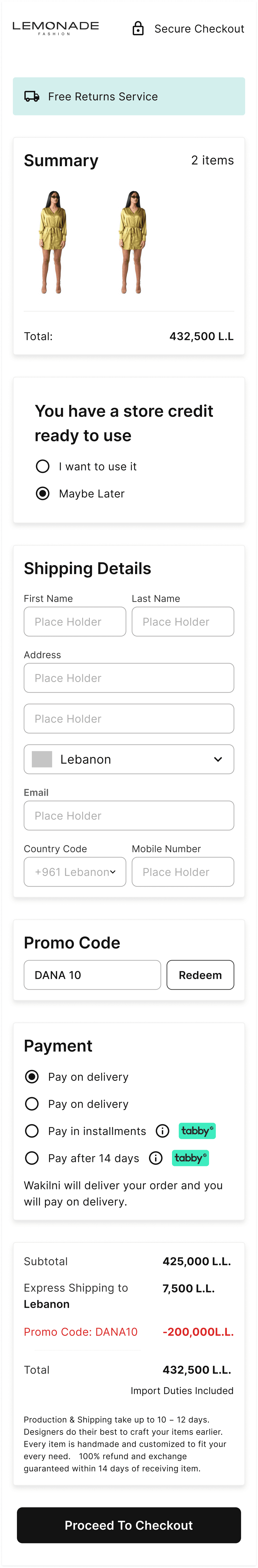
Final design
Checkout Page for first time users
Checkout Page for Mobile App
Testing Results
01. User is confused
The redesign currently includes the change from multiple page design to a single page one and adding the images to the summary, and now the dev department is working on including saving shipping addresses and payment methods
Before
High Drop rate (95% drop rate)
Takes more than two minutes to finish the checkout process.
Not understandable summary section.
Issue with error messages.
After
Decrease in drop rate to 88%
Turned into a single page checkout.
Developers are adding the option to save addresses and payment methods.
Takes less than a minute to finish the checkout process.
Summary section includes images of items.
Error messages appear directly when an error occurs.
Project Impact
Decrease in drop rate by 8%
Next Steps
Continue observing the progress to make sure there are no issues with the solution.
Recheck with developers after completing the rest of the feature and observing the progress.